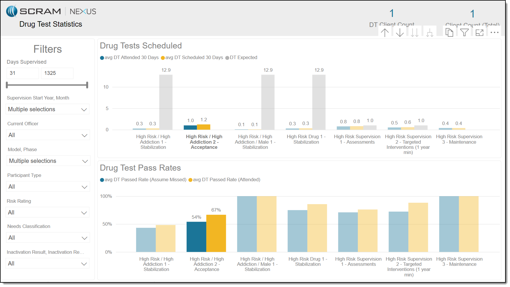
Performance Analytics in SCRAM Nexus Family is an invaluable tool that can be used to evaluate how well your program is performing in relationship to YOUR established policies. To access this data, click the Reports icon then click the Program Performance tab. Are clients attending more or less drug-test appointments over time? Overall, are enough drug test appointments being scheduled when compared to past or current policies? These questions and others can be evaluated, and decisions made using the data presented here.
Drug Tests Scheduled
By default, the data displayed in the Drug Tests Scheduled section represents the average number, for all clients in each Phase/Model over a minimum of 30 days, of drug tests:
- Attended – Blue
- Scheduled – Yellow
- Expected (according to policy) – Gray
Drug Tests Pass Rates
Also, by default, the data displayed in the Drug Test Pass Rates section represents the average pass rate, for all clients in each Phase/Model over a minimum of 30 days, of drug tests:
- Attended – Blue
- Missed (assumed) – Yellow
Filters
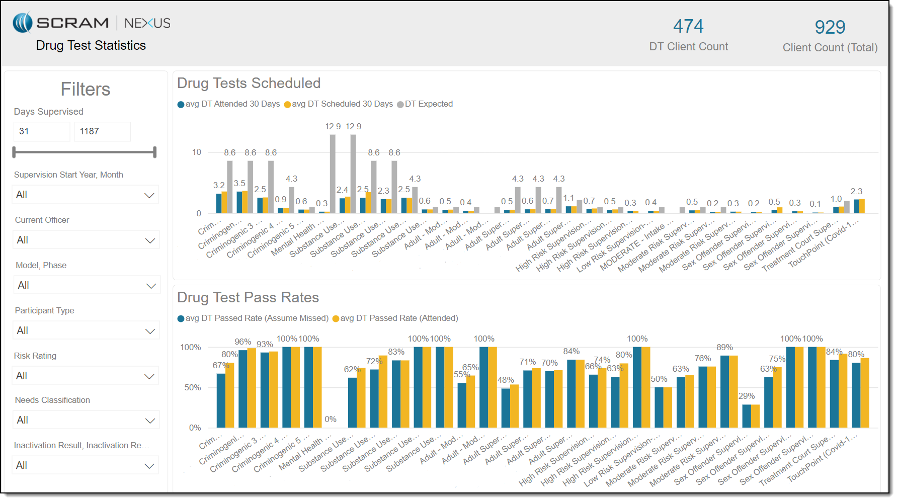
As you see in the image above, a tremendous amount of data is displayed by default on the Drug Test Statistics page. Consequently, it is important to effectively use the filters provided to parse the data into usable chunks for analysis, as shown in the image below.
Note: The options listed in the following drop-down lists are configurable.
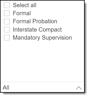
- Model, Phase
- Participant Type
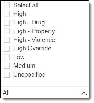
- Risk Rating
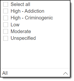
- Needs Classification
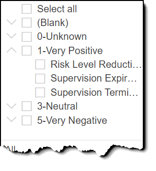
- Inactivation Result, Inactivation Reason
Filters included are:
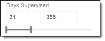
- Days Supervised – Allows you to reduce or expand the window of supervision days that will be represented on the graphs. The specifics of this powerful filter are:
- The number on the left represents the minimum number of days, since supervision began for each client, that are presented on the graphs.
- The number on the right represents the span of time, since your program began, that is presented on the graphs.
- The left and right borders on the slide bar can be moved to increase or decrease the “days supervised” data presented on the graphs.
- When the borders are moved, the graphs are dynamically updated.
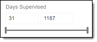
Example 1: In the image above, the data presented on the graphs will represent all supervised days for all clients since the inception of your SCRAM Nexus Family Program.
Example 2: In the image below, the data presented on the graphs will represent the first 365 days of supervision for all clients.
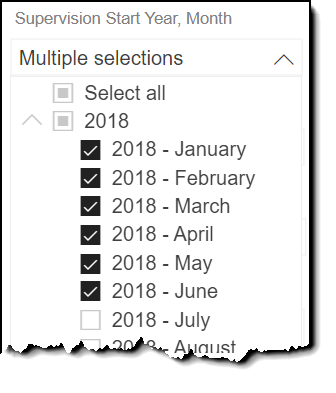
- Supervision Start Year, Month – Allows you to select specific years and/or specific months in any year in which data will be represented on the graphs. This filter isn’t there anymore.
Example: In the image below, only supervision data for the first six months of 2018 are represented on the graphs.
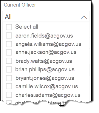
- Current Officer – Allows you to present drug test schedule and drug test pass rates data on the graphs for one or more specific officers. This filter isn’t there anymore.
- Gender, Age – New
- Ethnicity – New
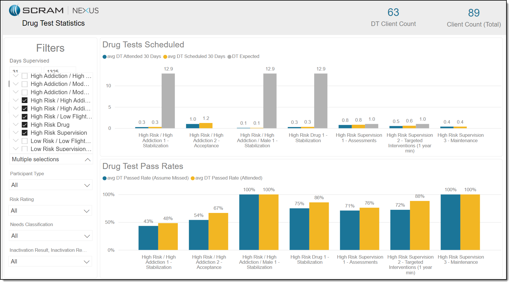
- Model Name, Phase Name – Allows you to select one or more models/phases for focused analysis of the data presented on the graphs for those entities. As you see in the image below, clicking on the arrow to the left of a model displays all phases of that model.
- Participant Type – Allows you to focus your attention and analysis on a certain type of client being monitored using SCRAM Nexus Family.
- Risk Rating – Allows you to isolate and evaluate the data displayed on the graphs by the risk rating that is associated with each client.
- Needs Classification – Allows you determine the data presented on the graphs based on how each client’s needs are classified.
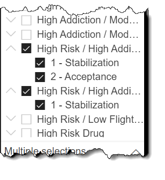
- Inactivation Result, Inactivation Reason – By parsing the data by inactivation result and reason, you get an invaluable visual indication of the success of your SCRAM Nexus Family Program. As demonstrated in the image below, clicking on the arrow to the left of an inactivation result displays all reasons for that inactivation.
Graph Features
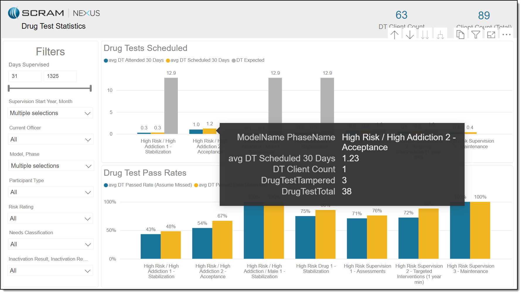
Mouse over Model/Phase
Placing the cursor over a specific graph bar displays a pop up with details for the data item for a specific model phase. In the image below, details regarding the average drug tests scheduled over 31 days for the “High Risk / High Addiction 2 – Acceptance” phase are shown.
Select Model/Phase
You have the option to click on a specific phase of a model to gray out the other phases; allowing you to focus on the data presented for that phase. The data for the “High Risk / High Addiction 2 – Acceptance” phase is shown.